Technical Docs Redesign
Front End Development —
Jekyll
HTML
CSS, SASS
JS
Gitlab
Technical Documentation and Product Marketing Intern — ModalAI
June 2021 — Present

Background
ModalAI's documentation site runs on Jekyll, a static site generator. The jekyll theme used is called "Just the Docs", an open source theme which the company has used for quite some time on its basic component library. To test my front end skills, I built out a new component library for the documentation site which includes a new navbar, new usability features, and new product cards for top level domains.
The Old
ModalAI's documentation site runs on Jekyll, a static site generator. The jekyll theme used is called "Just the Docs", an open source theme which the company has used for quite some time on its basic component library. Since my beginning at ModalAI, I had always thought the documentation site was lackimg. Although it was outside of the job description, I put my front end skills to the test building out a new component library for the documentation site which includes a new navbar, new usability features, and new product cards for top level domains. I changed components within the css and sass library, changed features within existing components, and even added new JS features for the page scroll function on the top.
Problems with the old
- The site bar gets way too convoluded when you open multiple child elements at the same time
- Its tough to know where you are in the nav menu, the arrows to close the headings are not particuarly big and don't stand out
- Very little use of color and image in the navigation makes it tough to quickly nagivate. "Recollection rather than recall" "A picture is worth a thousand words"
- Overreliance on Table of Contents for navigation on main level headings is boring and is not easy to navigate
- Could do much better about having bright and interesting "Buy Now" buttons
- The colors are not on brand and are not interesting. The company logo does not appear a single time on any of the pages
Getting to work
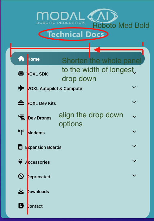
First, I started by messing around on the element inspector to see what I could change. I then became more familiar with the website's file structure and with the static page generator and its functions. I built out my first prototype of the navbar in blue, and worked with the marketing team for feedback and to make sure the redesign was aligned with the company brand.


The Redesign
I slowly added elements along the way and tested them on different screen sizes to make sure the responsive design of the site was maintained. Below is a list of the new features and improvements on the site:
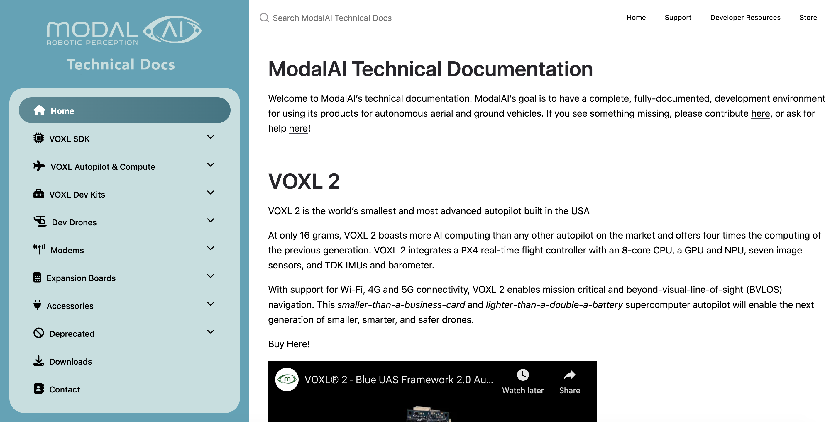
- Added logo on the top left for branding, and changed site colors to match company colors
- Made the navbar larger, added icons, and changed the hover functionalities to match branding
- Added much clearer icons for closing nav elements, so that its much easier to locate yourself within the nav menu
- Added background shading on the list elements, so that its easier to group together items from the same lists
- Added new product cards, with much clearer buy buttons. Functionality is easy to expand and is a simple option in the site generator that requires a summary, buylink, and thumbnail variable for the page
- Added new navbar animations and a page scroll function for usability
- Made the store button stick out more on auxiliary nav
Check it out now on docs.modalai.com!
What I learned
This was a real test of my frontend skills and was the first time i've worked within a static site generator like Jekyll. It was super satisfying to use my frontend skills at ModalAI and I think the results speak for themselves. Its a big improvement for our customers and client base and it drastically increases the usability of the docs site. ModalAI's documentation is complicated enough as is, and a helpful UI really does go a long way in helping the user understand our documentation offerings and where to go. ModalAI is small, it doesn't have a dedicated support staff, and so even small changes to take weight off of the ModalAI forums (that get bombarded by questions everyday) is a big difference. I also learned the value of taking a bit of initiative: this docs refresh is something outside of the job description, but its a valuable contribution to the docs experience.
Link to Project